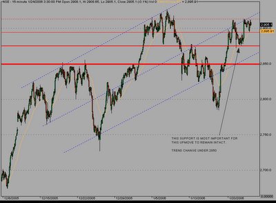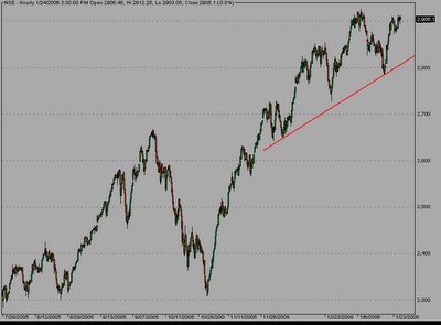

Two images are attached showing small and large time frames.
In this larger time frame image the red line joins the higher lows and if a lower low is made which violates it we know we have a change in trend. This is not to forget the forest when playing with trees.
For the shorter term analysis. Nothing much changed and we are still stuck in the corrective zone.
For Nifty sustaining > 2880 was a +ve. I came down and tested it. (went to 2875).
In the new image you can see series of red horizontal lines.
The thicker the line more resistive it is.
Under 2850 we got a change in trend.
If we remain >2875 we have a more strong trend.
Craking up through the upside resistance would take nifty to 2943 and next to 2985.
The corrective wave structure is not very clear now, as imp resistance zone attracts a lot of selling and it gets more difficult to give names to the corrective waves. We dont need to get very accurate with this to trade right. We can see nifty raising in step like fashion and and as long it keeps doing this longs are more favoured.
In the next post some charts are also attached in which crack of red line to downside would open up significant downsides. All are heavy weights, do keep them on ur radar to gauge the strength.
Got a view? Do write a comment.
1 comment:
My work suggests a topping formation. My basis is chart formation on the Sensex and market breadth data which I calculate
Post a Comment